Graphic Design


Project: LoneBass
Brand Identity | Logo Design | Stationery Mockup
Thought Process & Design Description:
This brand identity was built with simplicity and story at the forefront. I wanted the logo to feel like something you’d find on an old tackle box—nostalgic, hand-drawn, and full of charm. I started by sketching a fish that felt whimsical but rooted in nature, something that would resonate with small-town authenticity and outdoor spirit.
The name “LoneBass” inspired a feeling of quiet solitude—one fisherman, one lake, one moment. So I kept the linework raw and expressive, embracing imperfection as part of the aesthetic. The hand-lettered typography blends into the fish’s form like it belongs there, not slapped on as an afterthought.
From there, I expanded the brand into business cards and letterhead using natural tones—deep forest green and lake blue—to tie in with the outdoorsy vibe. This brand could easily live in a bait shop or on the shelf of a small family-owned store.
I love creating designs that feel handmade and personal. When someone sees this, I want them to feel like they already know the brand, like it has a soul.


Project: Collures Crank Bait Packaging
Logo Design | Product Packaging | Brand Identity
Thought Process & Design Description
This branding and packaging set was inspired by the backwoods charm and quiet strength of Northern Michigan. Collures, a crank bait company founded by a local fisherman named Cole, needed a visual identity that felt authentic—rooted in the land, the water, and the generations who’ve fished them both.
The logo combines a bold serif font with a dynamic bass illustration mid-leap, casting motion across the brand name like a line through water. It’s energetic, handcrafted, and built to stand out on shelves and in tackle boxes.
The packaging embraces natural textures and a muted woodland palette. Kraft tones, pine silhouettes, and raw woodgrain evoke mornings on the lake and quiet moments in nature. On the back, you’ll find simple specs and a short brand story, stamped with Michigan pride.
This project celebrates grit, tradition, and the art of making something that lasts—just like the lures themselves.
Project: Makenna & Ben Wedding
Invitation Design | Watercolor Illustration | Print Layout
Thought Process & Design Description
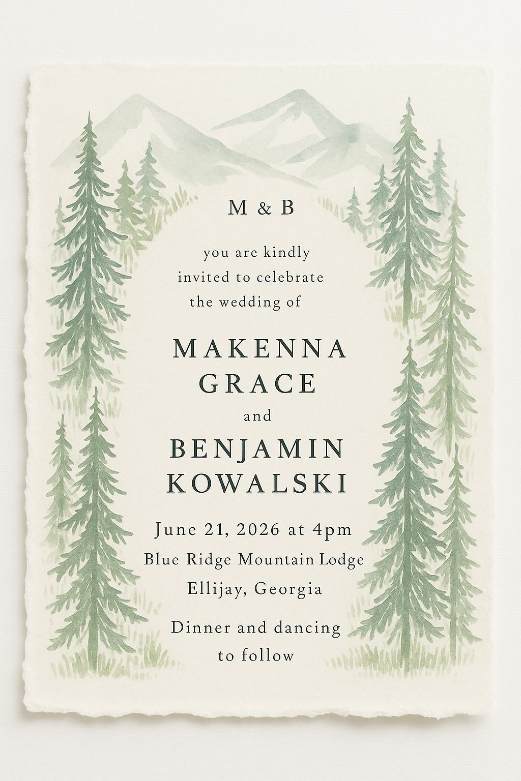
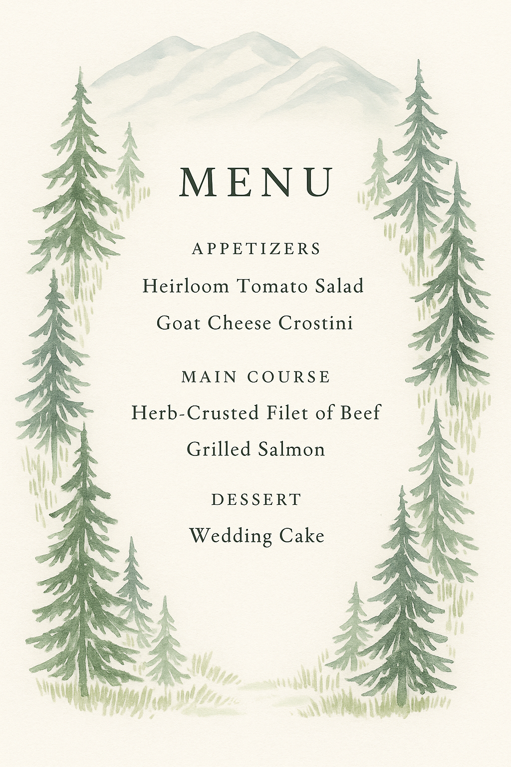
This invitation and menu set was designed to capture quiet mountain romance through soft watercolor pines, misty peaks, and warm ivory tones. The hand-painted elements and gentle sage palette create an organic, timeless feel inspired by North Georgia’s natural beauty. A classic serif typeface and clean layout bring elegance and balance, resulting in a calm, refined suite rooted in rustic charm and heartfelt simplicity.
Project: Deep Sea Glow
Digital Retouching | Light Effects | Creative Photo Manipulation
Thought Process + Design Description
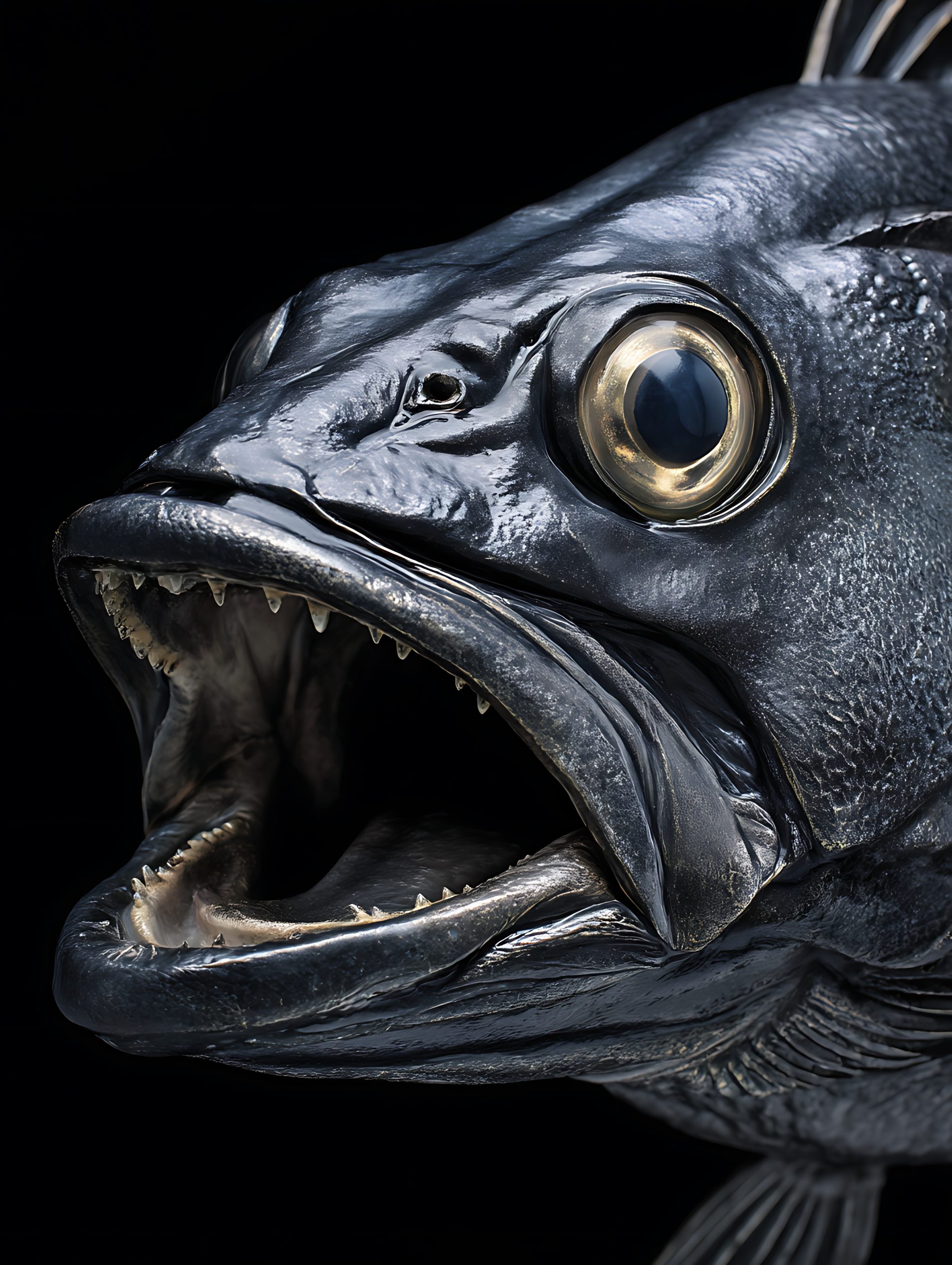
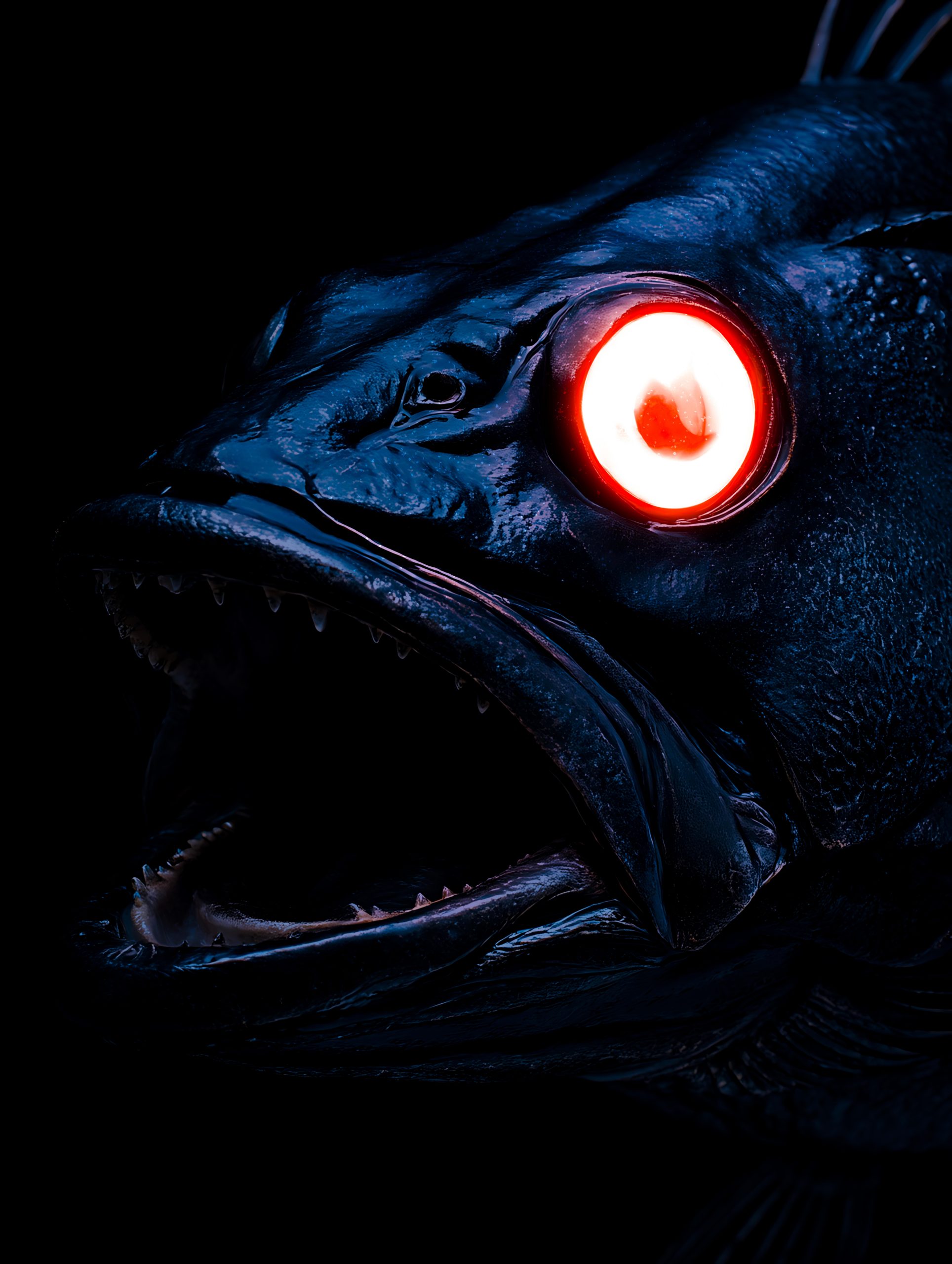
This concept explores the dramatic tension between natural anatomy and surreal digital enhancement. Starting with a deep-sea predator, I focused on amplifying its most striking feature—the eye—by transforming it into a glowing focal point. Through selective lighting, color blending, and layered glow effects, this piece pushes realism into the realm of the uncanny, creating a bold, cinematic transformation.
The project showcases my ability to manipulate mood and atmosphere through digital techniques, balancing sharp texture detail with luminous effects. The result is an intense, other-worldly portrait that highlights how subtle illumination can reshape a subject’s presence and emotion, even in the darkest environments.
Project: TrueVine Foundation “Hatchet” Flyer
Flyer Design | Youth Program Marketing | Outdoor Flyer
Thought Process & Design Description
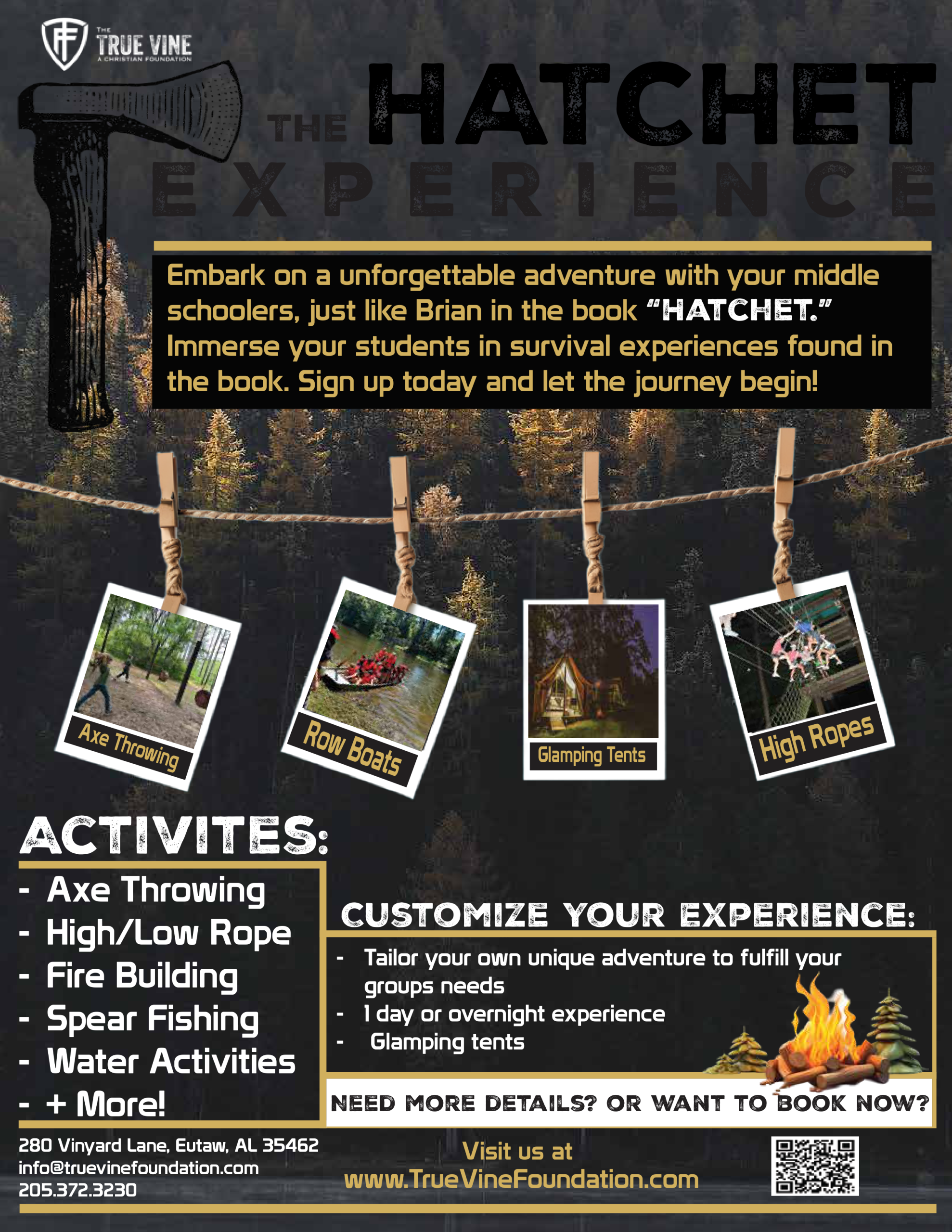
I designed this flyer for TrueVine Foundation in Eutaw, Alabama to promote their immersive “Hatchet” survival experience for middle-school students. The goal was to communicate adventure, education, and outdoor excitement through bold visuals and clear program information. The layout highlights key activities, contact details, and the program’s hands-on learning approach, creating a clean, energetic design that appeals to parents, teachers, and youth leaders while reflecting the rugged, nature-focused spirit of the experience.




Project: Logo Collection
Brand Identity | Illustration | Personal + Conceptual Design Work
Thought Process & Design Description
This logo collection brings together a variety of real and conceptual brands, each crafted with a distinct tone, purpose, and personality. From rustic jam jars to snowy ski clubs and dreamy cafés, the goal was to explore branding through playful illustration and intentional type pairing.
Josie Jam captures the warmth of a homemade product rooted in family tradition. The hand-drawn design, soft colors, and natural motifs reflect the brand’s small-batch, Michigan-made identity.
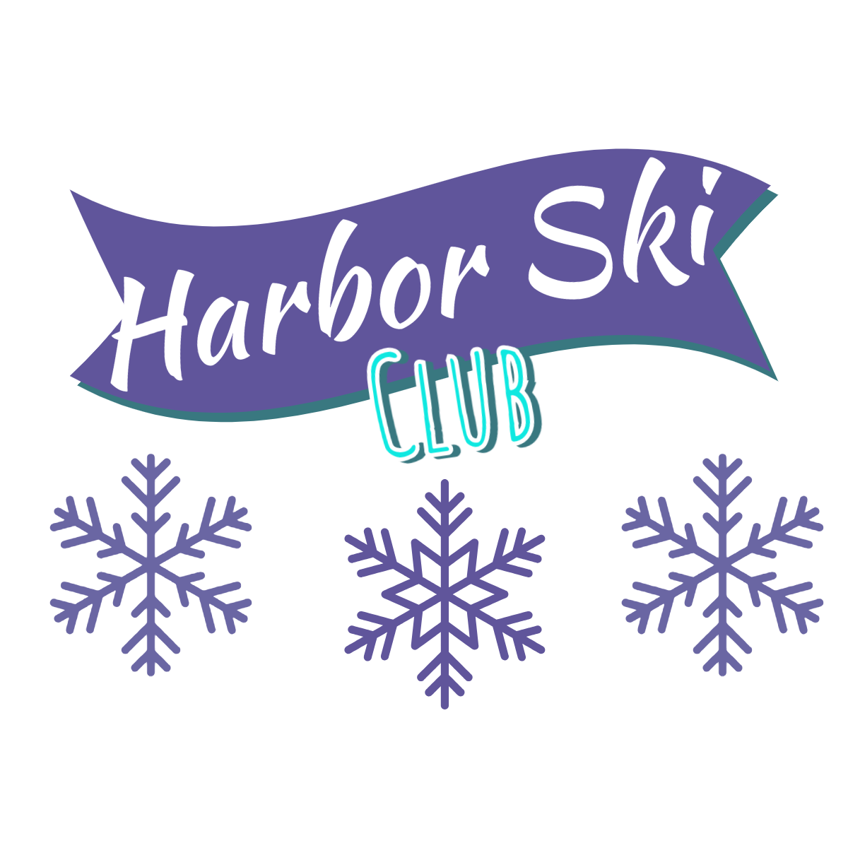
Nub’s Nob and Harbor Ski Club lean into vintage ski culture with bold, badge-style layouts and snowy mountain references. Both logos reflect a love for winter adventure and tight-knit community.
Dragon Fly Inn brings gentle charm and a quiet elegance to life. The soft dragonfly and floral tones feel timeless and inviting, perfect for a countryside bed and breakfast.
Pita Way adds bold, fast-casual energy with vibrant tones and curved typography—reflecting fresh flavor, movement, and approachability.
Rosey Açaí Bowls is delicate and romantic, with watercolor florals and a soft serif nameplate. Designed to evoke boutique café vibes, it blends femininity with freshness and whimsy.
This collection explores how color, type, and illustration work together to tell a brand’s story—whether real or imagined. Each design stands on its own while contributing to a larger narrative of creativity and identity.
Project: Maverik
Brand Refresh | Social Media Design | Marketing Asset Creation
Thought Process & Design Description
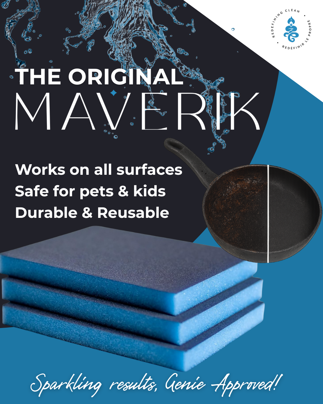
I was hired to support Maverik’s marketing efforts by refreshing visual brand elements and creating promotional social media content. The goal was to modernize the look and highlight key product benefits with clean typography, bold contrast, and fresh water-driven imagery. This design emphasizes safety, durability, and versatility, while strengthening Maverik’s digital presence with a polished, high-impact visual style.


Project: FreckledFaceBaby "I Dare You to Count My Freckles" Hoodie
Unisex Heavy Blend Hoodie | Print Design | Apparel Branding
Description:
A soft powder blue hoodie featuring clean, minimal text on both the front and back. The chest showcases the phrase “I dare you to count my freckles” in small white type—bold yet understated. On the back, the FreckledFaceBaby brand name is centered just below the hood, adding a subtle branded touch.
This unisex heavy blend hooded sweatshirt is relaxation itself. Made with a thick 50% cotton and 50% polyester fabric (8.0 oz/yd²), it offers a plush, soft feel alongside long-lasting warmth. The surface is ideal for printing, giving crisp, clean results. Features include a classic fit, spacious kangaroo pocket, color-matched drawstring, tear-away label, and no side seams for a smooth silhouette. It runs true to size for a reliable fit every time.
Thought Process & Design Details:
This design was created to embody the playful, confident spirit of FreckledFaceBaby. The phrase is a nod to self-love, individuality, and celebrating what makes you unique—freckles and all. The soft blue tone balances sass with sweetness, while the minimalist layout keeps it wearable and timeless. The branded back detail finishes the look with intention. Every detail was chosen to elevate the message while delivering premium comfort—making it a signature staple for the FreckledFaceBaby collection.


Project: FreckledFaceBaby – “Angel Kisses” Crewneck
Unisex Heavy Blend Crewneck | Print Design | Apparel Branding
Description:
A soft blush pink crewneck sweatshirt with minimal branding on the front and a heartfelt message on the back. The front reads FreckledFaceBaby in a petite, delicate font. On the back, the phrase “My freckles are my little angel kisses” is printed in a dreamy stacked layout, making it the star of the design.
Ideal for any setting, this unisex heavy blend crewneck is pure comfort. Made with a 50/50 cotton and polyester blend (8.0 oz/yd²), it delivers warmth, softness, and a smooth print surface. The ribbed knit collar holds its shape after washing, and there are no side seams, eliminating irritation. Features include a loose fit, sewn-in label, and a true-to-size cut—perfect for relaxed days with a touch of meaning.
Thought Process & Design Details:
This piece was made to speak softly but sweetly. The message on the back—“My freckles are my little angel kisses”—is a tribute to innocence, beauty, and self-love. We kept the front minimal to let the back speak for itself, like a little secret waiting to be seen. The pink tone was chosen for its softness and warmth, adding a dreamy layer to the overall feel. This crewneck balances cozy comfort with emotional connection, making it a standout staple in the FreckledFaceBaby line.
